THE BRIEF /
As a marketing agency and consultancy, designing our own branding was always going to be a challenge. Setting a brief for ourselves demanded both clarity and honesty—what did we truly want our brand to represent? We knew the branding needed to be professional, reductionist, and timeless, embodying our ethos of simplifying the complex and keeping the focus on our clients.
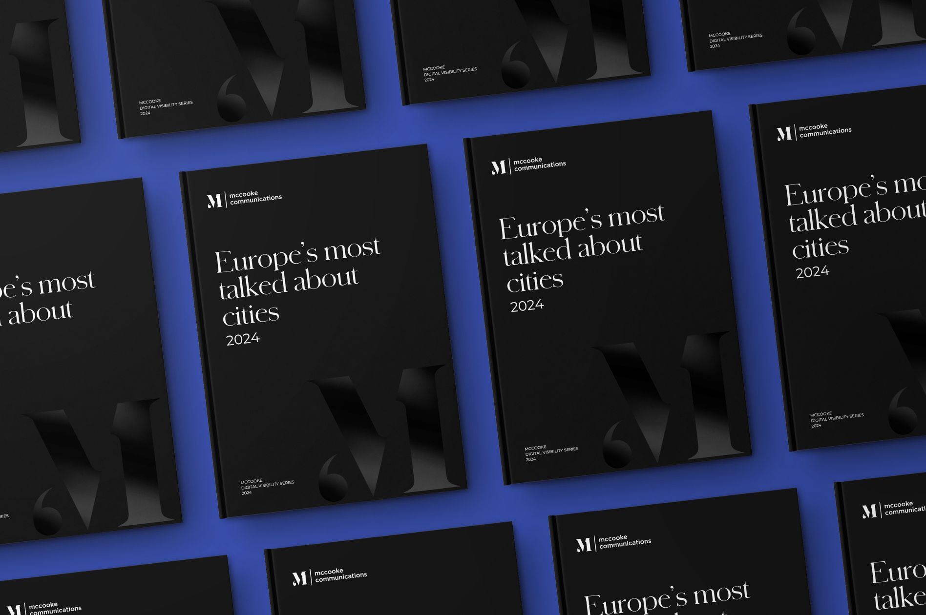
The logo needed to encapsulate the essence of communication in a subtle yet powerful way, striking a balance between creativity and professionalism. Additionally, we wanted a flexible colour palette that could adapt to a variety of uses, allowing us to prioritise clean, monochrome visuals while incorporating pops of colour to enhance materials like charts and brochures. Above all, the branding had to reflect not only who we are but also how we work.
THE SOLUTION /
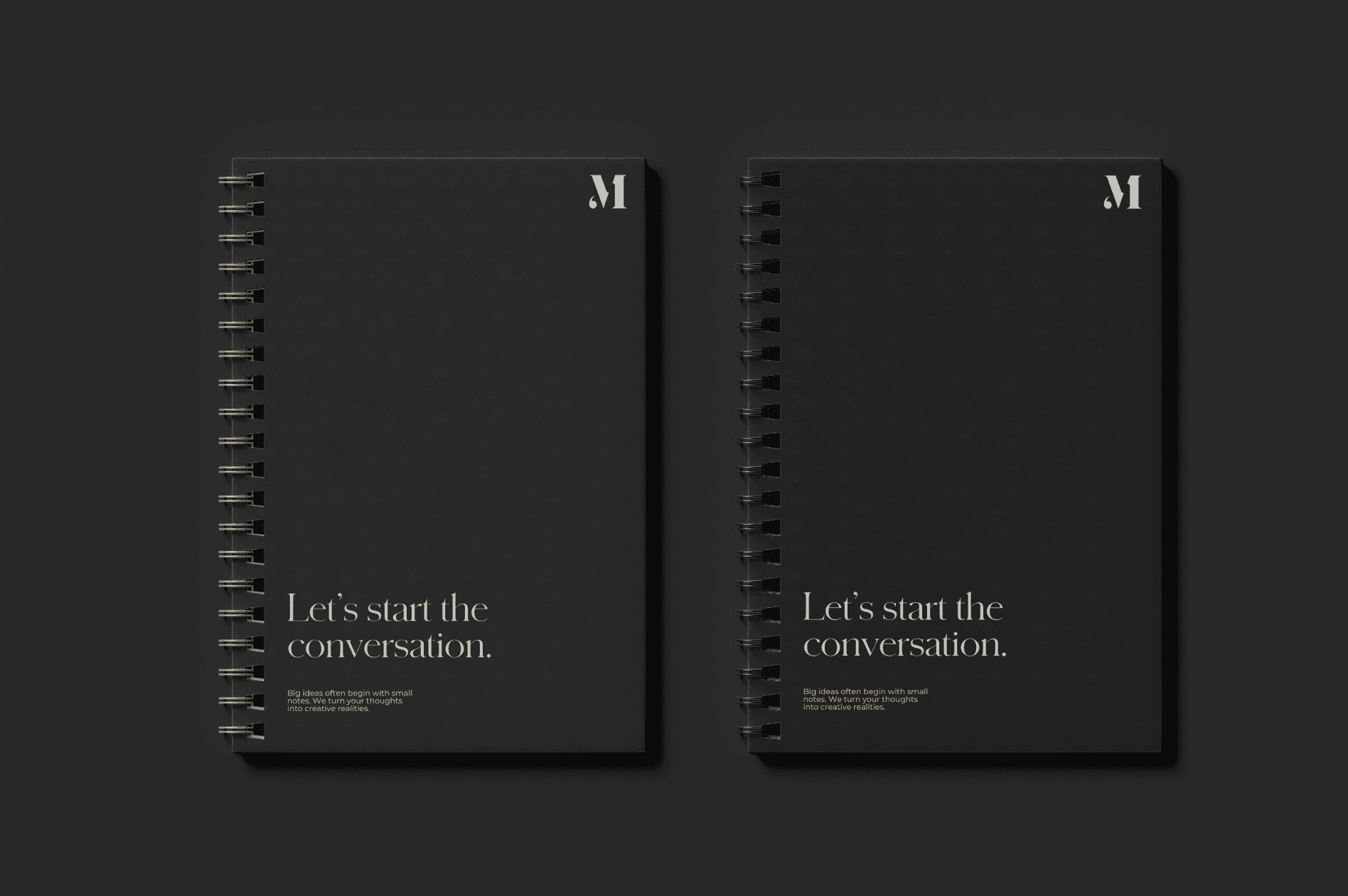
We approached our branding project with the same reductionist mindset we bring to client work: focus on the essentials, eliminate the unnecessary, and let the message shine. The logo we developed centres on an elegant “M,” with a carefully crafted inverted comma integrated into the design. This simple yet meaningful detail—a symbol often associated with quotation and speech—highlights the importance of dialogue and storytelling, core aspects of effective communication. By incorporating this symbol into the logo, we emphasise our role in helping clients articulate their messages clearly and compellingly, underlining our commitment to fostering meaningful connections and impactful narratives.
Our colour palette reinforces this clarity. Charcoal and white were chosen as core colours to create a timeless, professional foundation, ensuring the focus remains on our clients and their campaigns. Secondary colours, including Champagne golds and a striking Cobalt Blue, were introduced for flexibility. The blue adds vibrancy and modernity, evoking trust and innovation, while the gold brings warmth and sophistication. These accents are used sparingly to enhance visuals like graphs, charts, and brochures, creating visual interest without detracting from the minimalist aesthetic.
By combining a clean, reductionist design with thoughtful details, we created a brand identity that embodies who we are: a creative marketing consultancy dedicated to clarity, creativity, and putting clients first.


